
Petal & Stem: Annual Report 2025

Objective
Arrange dense copy in an easily followed and aesthetically pleasing manner, complemented by relevant original drawings and/or photography.

Layout Direction
The spreads were designed to feel airy and readable, using hierarchy and pacing to keep dense information from becoming overwhelming.
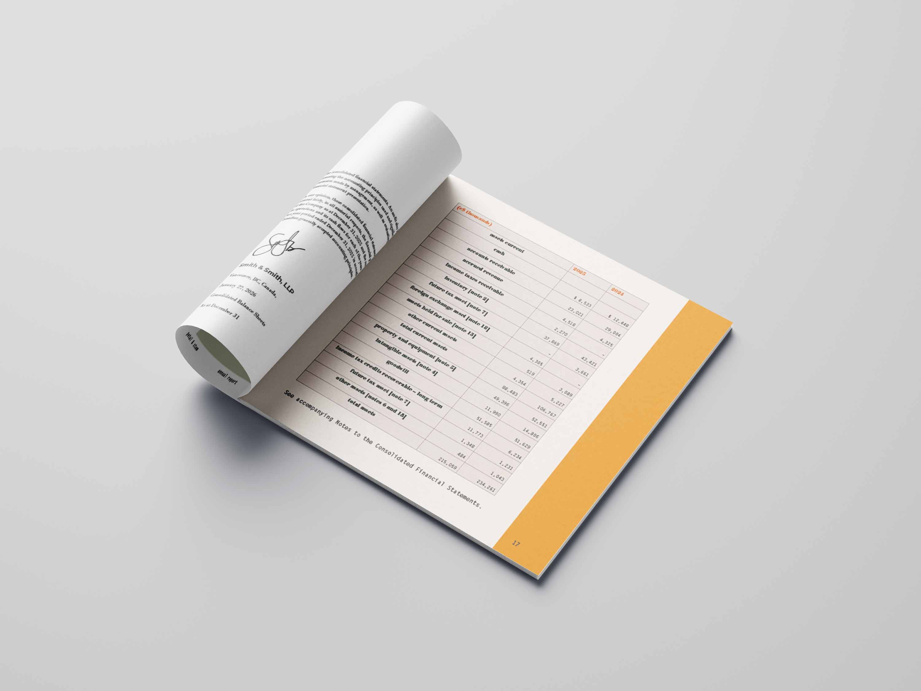
Information Design
Charts and structured data layouts help organize heavier content into sections that feel clear and easy to move through.

Image Use
Transparent floral overlays soften the layout and help integrate photography into the editorial system without overwhelming the text.

Navigation and Structure
Pages such as the location map and staff directory were designed to make practical information feel visually cohesive with the rest of the report.

Final Effect
The final result feels warm, editorial, and polished, balancing clarity with atmosphere through image, hierarchy, and pacing.


Photo Taking and Treatments
Photos of plants and flowers were taken at The Leaf, then edited in a warm tone with heightened clarity, a subtle fade and barely-here grain.